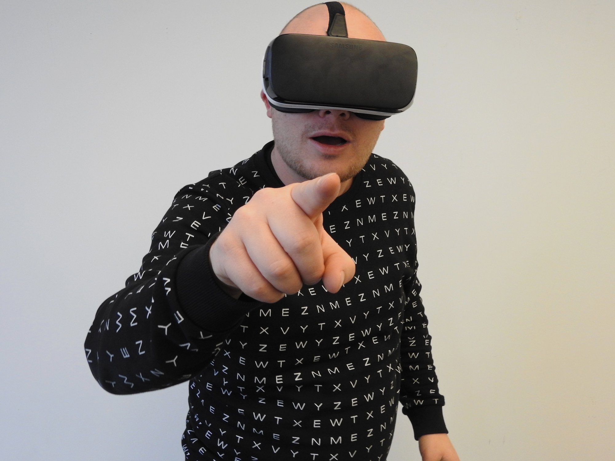
As technology continues to evolve, most digital marketers also look for ways to innovate their real estate business strategies. While content is still king, we’ve learned how to innovate it by engaging in different multimedia. We’ve started incorporating images, infographics, GIFs, and videos in our marketing campaigns. Nowadays, we also see how 360 virtual tour seems to boost our views and engagements tremendously.
The experts claim the interactive virtual tour helps them reach out to remote customers all over the world. It also offers convenience as their clients don’t have to go physically to check out the properties. It resulted to increase in real estate sales. Despite its stunning benefits, many realtors claim they still struggle with virtual tours. Why is that? It may be because you’re committing these fatal mistakes!
Learn How to Correct Your 360 Virtual Tour Mistakes here!
Staging Your Home With Little Or Too Much Medium
An empty property space is like a blank canvas. Your buyers want to imagine and immerse what it’s like to live in your proposed property. That’s why you need to capture these anticipating feelings through a 360 virtual tour. However, most realtors tend to declutter their spaces and only add minimal furniture or features virtually. This effectively turns your customers off since they feel the room is barren and empty. Prepare a 360 virtual tour addressing your customer’s needs.
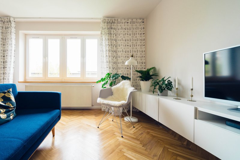
On the other hand, cluttering your home too much also turns your customers off since they feel the property is too narrow for them to add the amenities they want to incorporate. So how do you solve this problem?
According to real estate experts, you need to find the “Goldilocks” balance in home staging. Instead of putting virtual furniture, decor, and ornaments that are irrelevant to your customers attend to their needs instead. For example, if your customer is a fitness coach, do a 360 virtual tour where an unused room can be converted into a gym or yoga session place.
Dim Lightings In Your Virtual Tour
Most realtors commit the mistake of ignoring lighting thinking the software will do the job of lightening up the virtual tour. While the software can help improve your 360 virtual tour resolution, it may end up being dim or having inconsistencies.
Having dim lighting makes your property look smaller; while inconsistent lighting also creates some jarring experience for the user. You can produce consistent lighting by a combination of sunlight, as well as your home’s cardinal orientation. Having a well-lit house makes your property look inviting and spacious.
Not Making a Self-Guided Interactive 360 Virtual Tour
Just like how the customers have full control once they bought a property, they also want to exercise the same control in a 360 virtual tour. Don’t make the mistake of having pre-programmed virtual tours. Allow your buyers to navigate each room and move around the property how they want.
They should be able to see every angle, approach, and corner of the property. Not only it improves their interactive experience, but they also tend to dwell longer in your 360 virtual tours. Higher and longer virtual tour engagements lead to higher real estate sales.
Not Highlighting Your Property’s Unique Features
While it’s great to highlight every corner and angle of your property, don’t forget to give extra attention to your unique features. For example, you can highlight the master’s bedroom’s terrace which offers an overlooking view of the beach. The peaceful scenery triggers a relaxing ambiance for your customers. You can also highlight infinity pools where they can swim and chill after a long day.
Whatever unique features you have in your property, make sure to highlight it in your 360 virtual tour to entice your customers.


